See which design trends our editors are ready to see phased out in the new year.
The past year brought us new home design trends that we absolutely love (
bold wallpaper and
colorful kitchens, for example), but some are in need of a refresh. Check out which trends our editors feel have had their time in the spotlight and need to evolve in 2017.
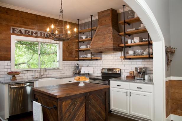 I’m tired of shiplap and the whole cottage-inspired, farmhouse-chic look. There. I said it. I like when Joanna Gaines does it because that’s her signature look. But if you have a 'Fresh-Baked Pies Here' faux vintage sign, then I expect there to be real pies in your kitchen. — Kayla, Managing Editor
Lindsay Pennington
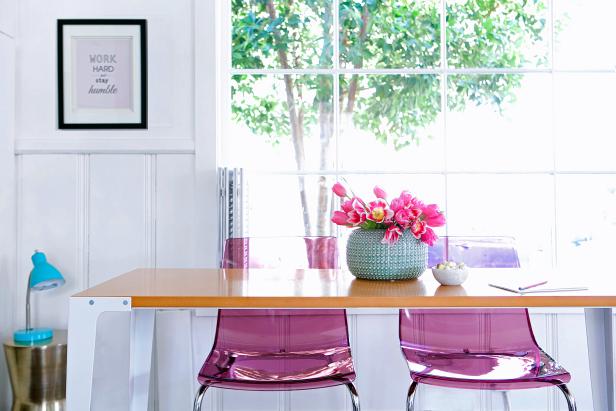
I personally don’t think it does anything for a room’s design aesthetic. And let’s be real here—it’s just glorified plastic. — Farima, Assistant Editor
Jim Tschetter
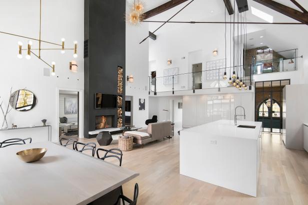
I’m all for optimizing the home for entertaining and functionality, but when there’s an echo in the living room, that’s not 'open' — that’s cavernous. It seems like opening up the kitchen, dining and living spaces just creates more room for clutter (and noise) to spread. I’d like to see more creativity in home flipping, making outdated floor plans work for modern life. Let’s embrace the quirkiness of old homes and be more judicious about knocking down walls in 2017. — Molly, Apple News Editor
Courtesy of the manufacturer
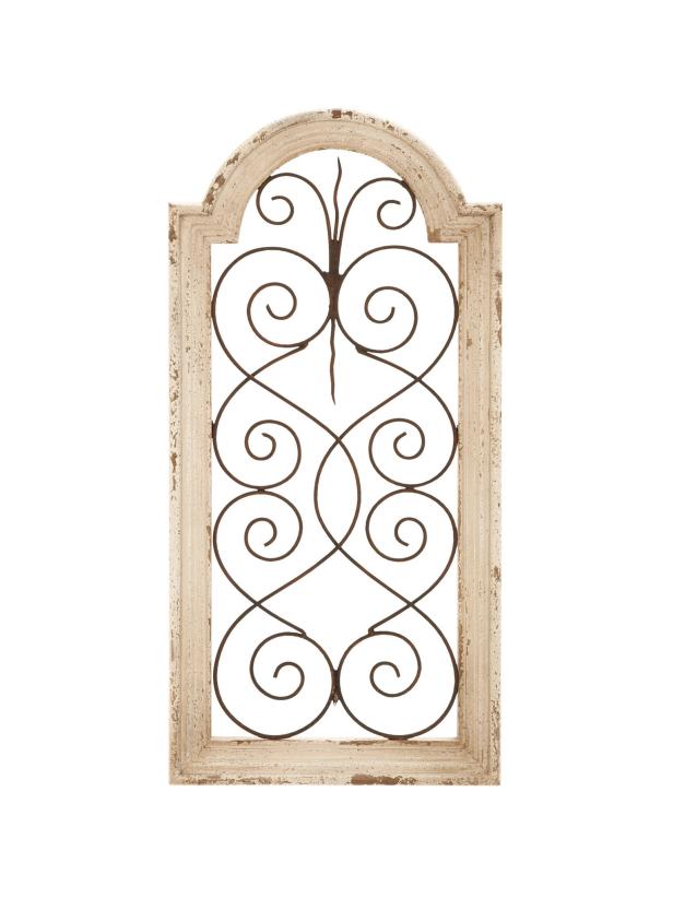
These faux gate-in-a-frame things need to go away — quickly. Hang pretty pictures on your wall instead. — Jackie, Editor
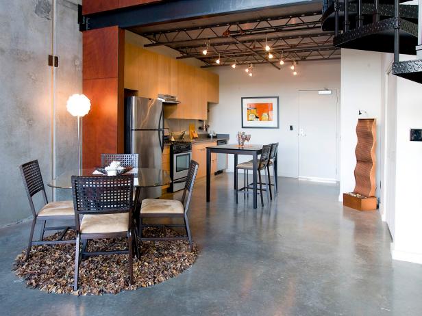 The warehouse aesthetic is one I’m definitely hoping to leave behind in 2016. I’m all for modern decor, but I draw the line when it comes to exposed duct work, concrete countertops, Edison light bulbs and floating staircases. Millennials may love it, but I’m hoping to see these design elements used in a more practical way. — Ryan, Editor
By: Ryan Reed
Amber Castonguay
Click here to download my personal RE/MAX App! AGENT KEY: ambercastonguay


No comments:
Post a Comment